Sunday, July 26, 2009

Switching WPF interface themes at runtime, Part 2

In my previous post, Switching WPF interface themes at runtime
,I explained how we can easily switch between interface themes at runtime using a simple property and even databinding. That was OK for a single element, or a single window. But what about if we have an application with a lot of windows? Not that hard, just set the property on every window. Yes, that would work, but it has some disadvantages. For example, we change the theme on one window, then we must implement some logic to change it to all other windows that are open, otherwise you are left with windows on the same application with different themes, and that's just ugly. It also can introduce a lot of bugs. And, it is also very boring.

Using a global theme for the application

The idea is that we want to have a theme that should be applied on all of the windows of the application and that can be switched easily at a central location. So I continued working on my ThemeSelector class. I introcuded a property called Global Dictionary, which would be used for all elemenst registered with the theme selector. I also added another attachable property, which is boolean and tells the theme selector whether the element should use the global theme or not.
Let's take a look at the new code:


#region Global Theme

private static List elementsWithGlobalTheme = new List();

private static Uri globalThemeDictionary = null;

public static Uri GlobalThemeDictionary
{
get { return globalThemeDictionary; }
set
{
globalThemeDictionary = value;

// apply to all elements registered to use the global theme
foreach (FrameworkElement element in elementsWithGlobalTheme)
{
if (GetApplyGlobalTheme(element))
ApplyTheme(element, globalThemeDictionary);
}
}
}

public static readonly DependencyProperty ApplyGlobalThemeProperty =
DependencyProperty.RegisterAttached("ApplyGlobalTheme", typeof(bool),
typeof(MkThemeSelector),
new UIPropertyMetadata(false, ApplyGlobalThemeChanged));

public static bool GetApplyGlobalTheme(DependencyObject obj)
{
return (bool)obj.GetValue(ApplyGlobalThemeProperty);
}

public static void SetApplyGlobalTheme(DependencyObject obj, bool value)
{
obj.SetValue(ApplyGlobalThemeProperty, value);
}


private static void ApplyGlobalThemeChanged(DependencyObject obj, DependencyPropertyChangedEventArgs e)
{
if (obj is FrameworkElement)
{
FrameworkElement element = obj as FrameworkElement;
if ((bool)e.NewValue) // if property is changed to 'true', then add to the list of elements and apply theme
{
if (!elementsWithGlobalTheme.Contains(element))
elementsWithGlobalTheme.Add(element);

// apply the theme
ApplyTheme(element, GlobalThemeDictionary);
}
else
{
if (elementsWithGlobalTheme.Contains(element))
elementsWithGlobalTheme.Remove(element);

// apply the local theme instead of the global
ApplyTheme(element, GetCurrentThemeDictionary(element));
}
}
}

#endregion
That's all we need. When the ApplyGlobalTheme is set to true on an element, it starts using the global theme. If this is set to false, the element is switched back to the local theme set with the ThemeSelector, or to no theme at all. When the global theme is changed, the code searches all elements that use it and apply the new one. That's not something very complicated but it makes our lives a lot easier. The ApplyTheme(..) method is the same method I used on my previous post, you can look it up there to understand it better. But just in case, I will post it here:


private static void ApplyTheme(FrameworkElement targetElement, Uri dictionaryUri)
{
if (targetElement == null) return;

try
{
ThemeResourceDictionary themeDictionary = null;
if (dictionaryUri != null)
{
themeDictionary = new ThemeResourceDictionary();
themeDictionary.Source = dictionaryUri;

// add the new dictionary to the collection of merged dictionaries of the target object
targetElement.Resources.MergedDictionaries.Insert(0, themeDictionary);
}

// find if the target element already has a theme applied
List existingDictionaries =
(from dictionary in targetElement.Resources.MergedDictionaries.OfType()
select dictionary).ToList();

// remove the existing dictionaries
foreach (ThemeResourceDictionary thDictionary in existingDictionaries)
{
if (themeDictionary == thDictionary) continue; // don't remove the newly added dictionary
targetElement.Resources.MergedDictionaries.Remove(thDictionary);
}
}
finally { }
}

Using the Theme Selector with the global theme


Changing the global theme is easy. Just one line:


MkThemeSelector.GlobalThemeDictionary = new Uri("/ThemeSelector;component/Themes/ShinyRed.xaml",
UriKind.Relative);

And that's it. All of the elements that use the global theme will be switched. But how to tell the element that it uses the global theme? Just set the ApplyGlobalTheme attached property to true.


Let's see some screenshots.

This is a two-windows application with the no theme applied.


Let's see what happens when we change the global application theme using the Theme Selector.


Great. Both windows switched their themes. With just only one line of code.

Download Sample

The sample application can be downloaded here.

Saturday, July 25, 2009

Switching WPF interface themes at runtime

WPF introduced the use of dynamic resource references. They're very helpful in rich application development. The dynamic resources are loaded at runtime, and can be changed at any time. Dynamic resources could be styles, brushes, etc. WPF however does not provide a convenient way of changing the resource references. That's why I've created a simple class that allows the developers to switch different resources very easy.

Using dynamic resources

Creating and applying a dynamic resource is easy in WPF. First, we need to define the resource:


Then, we have to reference the resource like this:


And that's it. WPF searches for a resource with the given key and applies it when it's found.


Changing the dynamic resources at runtime


As I said, dynamic resources are applied at runtime, that means they can be changed. Let's assume that we have defined several resources like brushes and styles, and we want them to be in two variants - for example a red theme and a blue theme for user interfaces. We put all of the resources for each theme in a different resource dictionary file. For this example, I use the WPF Themes which can be found here: http://wpf.codeplex.com/Wiki/View.aspx?title=WPF%20Themes. So, assume that we have two resource dictionaries:

ShinyBlue.xaml
ShinyRed.xaml

Without these themes, a WPF window should look something like this:


Using the themes is pretty easy, all we need to do is merge one of the resource dictionary to the resources of root control or window:


And now, the window looks like that:


Pretty neat, huh? OK, that's good, but what if we want to change the theme to the red one? We have to go in the XAML code, change the source of the merged resource dictionary and recompile. No way! We should be able to come up with something nicer.

Well, there's a solution. See, everytime when the resources of a framework element are changed (added or removed resources), WPF goes through all elements with dynamic resource references and updates them accordingly. So the solution should be obvious - when we need to change the theme, we can simply remove the old merged dictionary, and add the new one. I searched a bit in the internet, and the most common solution is to clear all merged dictionaries from the collection and then add the desired one. Yes, allright, that would work. But what if the developer has added more than one resource dictionary, not only the one with the theme resources? Everything goes away, and bang, the software is not working. So there should be a proper way of detecting which resource dictionary contains the theme resources, and leave the other dictionaries alone.

It sounds a bit complicated, right? First, search for the right resource dictionary, then remove it from the list of merged dictionaries, then load the new one, and apply it. Yes but what if it could be done jyst by setting one single value to one signle property, and all is OK?

The ThemeSelector class

So there is it. The solution. I created a class which has an attachable property - the URI path to the desired theme dictionary. Now, let's think about finding the right dictionary to be removed when themes are being switched. Kinda obvious solution is a new class that inherits ResourceDictionary. Then, we search all merged dictionaries and remove those which are of this new type. Pretty simple, right? Here's the class:


public class ThemeResourceDictionary : ResourceDictionary
{
}

So it's time to see the real deal.

public class MkThemeSelector : DependencyObject
{

public static readonly DependencyProperty CurrentThemeDictionaryProperty =
DependencyProperty.RegisterAttached("CurrentThemeDictionary", typeof(Uri),
typeof(MkThemeSelector),
new UIPropertyMetadata(null, CurrentThemeDictionaryChanged));

public static Uri GetCurrentThemeDictionary(DependencyObject obj)
{
return (Uri)obj.GetValue(CurrentThemeDictionaryProperty);
}

public static void SetCurrentThemeDictionary(DependencyObject obj, Uri value)
{
obj.SetValue(CurrentThemeDictionaryProperty, value);
}

private static void CurrentThemeDictionaryChanged(DependencyObject obj, DependencyPropertyChangedEventArgs e)
{
if (obj is FrameworkElement) // works only on FrameworkElement objects
{
ApplyTheme(obj as FrameworkElement, GetCurrentThemeDictionary(obj));
}
}

private static void ApplyTheme(FrameworkElement targetElement, Uri dictionaryUri)
{
if (targetElement == null) return;

try
{
ThemeResourceDictionary themeDictionary = null;
if (dictionaryUri != null)
{
themeDictionary = new ThemeResourceDictionary();
themeDictionary.Source = dictionaryUri;

// add the new dictionary to the collection of merged dictionaries of the target object
targetElement.Resources.MergedDictionaries.Insert(0, themeDictionary);
}

// find if the target element already has a theme applied
List existingDictionaries =
(from dictionary in targetElement.Resources.MergedDictionaries.OfType()
select dictionary).ToList();

// remove the existing dictionaries
foreach (ThemeResourceDictionary thDictionary in existingDictionaries)
{
if (themeDictionary == thDictionary) continue; // don't remove the newly added dictionary
targetElement.Resources.MergedDictionaries.Remove(thDictionary);
}
}
finally { }
}
}

As I said, the class as one dependency property and an callback method to handle the event of changing the value of this property. There everything is straight-forward. First, the new theme dictionary is loaded, and then the old one is removed. That's it.

Using the ThemeSelector class

Here comes the nice part. The usage of the class is as simple as changing the value of one single property.
        private void ChangeToRedTheme()
{
MkThemeSelector.SetCurrentThemeDictionary(this, new Uri("/ThemeSelector;component/Themes/ShinyRed.xaml", UriKind.Relative));
}
When this method is called, the theme changes:


The ThemeSelector class and WPF data binding

We can even use databinding to change the themes dynamically. Let's assume that we have a combo box which have two items - the red theme, and the blue theme:


Now, on the element to which we want to apply the theme, for example the root grid in the window, we set the following binding expression:
local:MkThemeSelector.CurrentThemeDictionary="{Binding ElementName=cmbThemes, Path=SelectedItem.Tag}"

So it looks like this:


And that's all. When we run the application, we have this combo box, allowing us to select the theme in runtime.


Download sample application

The sample can be downloaded here: Download sample

Using GPU-Accelerated shader effects in WPF

by Svetoslav Savov

With Service Pack 1 of .NET 3.5 the use of effects in WPF was significantly improved. The old so called “bitmap effects” were using the CPU to render the visual elements. As a result, when a BitmapEffect is used, the whole visual tree of the element on which it’s applied becomes software rendered. As you can imagine, this dramatically decreases the performance of the user interface, especially when you add animations or 3D scenes. The new effects are using the DirectX shader system and they are rendered using the graphical processor which is a lot faster when it comes to calculating pixels, and also it relieves the CPU of the time-consuming effect operations so it is free to perform other tasks. With Effects you can combine the programmability of the GPU and the flexible environment of WPF to create rich user interfaces with animations, data binding and 3D scenes.

What do you need?

For developing a WPF application with shader effects you need several things:

  • .NET 3.5 SP1 (of course :) )

http://www.microsoft.com/downloads/details.aspx?FamilyID=ab99342f-5d1a-413d-8319-81da479ab0d7&displaylang=en

  • DirectX SDK for the development stage

http://www.microsoft.com/downloads/details.aspx?FamilyID=ea4894b5-e98d-44f6-842d-e32147237638&displaylang=en

  • A tool to create the effects

The Shazzam Tool is a great tool for this - http://shazzam-tool.com

Getting started with Shazzam

First of all we can take a look at Shazzam. It comes with some sample shaders we can use for learning.

Start Shazzam and go to Shader Loader -> Sample Shaders.

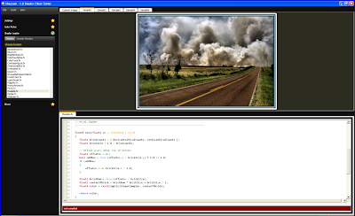
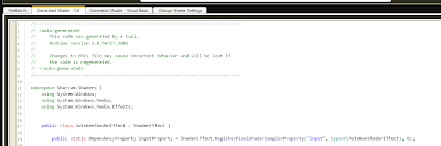
You can see the shader’s FX file, and a sample image which will be used to review and test the effect. Click on Tools->Compile Shader or press F7. Then click on Tools->Apply Shader (F5). When the shader is compiled you can see that Shazzam generated a C# class and a Visual Basic class that wrap the effect’s properties.

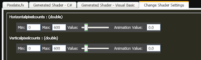
Also the Change Shader Settings page appeared. There you can see all the changeable properties of the effect and see in real time what happens when you change a property. To test the effect you can use one of the built-in sample images or you can select another.

Let’s try something out. Select the Pixelate.fx shader from the samples. Choose the first sample image (Sample1). Compile (F7) and Apply (F5) the effect. What happened? The image seems to have disappeared. That’s because the properties of the shader have default values of zero, and that just doesn’t work for our effect.


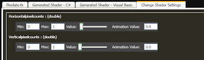
In the settings page, you can see some text boxes and sliders. They are used for changing the properties of the effect. First of all, you can see that there are a Min and a Max boxes with default values of 0 and 1. We have to change them to actually see the effect working. That’s because the system cannot know what the property is being used for, it doesn’t make any sense, it’s just a value. So the developers of Shazzam decided that the default values can be from 0 to 1. But in the case of Pixelate effect, the parameter values are in pixels. So we need to change them to 0-600 for both Horizontal pixel counts and Vertical pixel counts. And now when we move the sliders, we change the values from 0 to 600 instead of from 0 to 1. Now it makes sense.

So let’s change the values to about 100.


As we move the slider we can actually see what’s happening in the image above.


You can try some other effects from the samples, or browse the internet for third-party shaders. There are some nice video tutorials on Shazzam website, http://shazzam-tool.com.

Using effects in a WPF application

Adding the effect to a WPF project

The integration of a shader effect in WPF application is a relatively simple task.

First of all, it’s probably a good idea to add the compiled shader file to our WPF project. In Shazzam, go to the Tools menu and click on View Compiled Shaders. There are all the effects that we have compiled using Shazzam. In Visual Studio, select the project and right-click on it, choose Add New -> Existing Item and select the compiled effect file (the files are with .ps extension). Right click on the file in Solution Explorer and select Properties. Set the Build Action parameter to Resource.


Create a new code file, go to Shazzam, copy the auto-generated class code, and paste it in the new code file. You will see some dependency properties, and a constructor. So let’s take a look at the constructor.

public AutoGenShaderEffect(PixelShader shader) {

// Note: for your project you must decide how to use the generated ShaderEffect class (Choose A or B below).

// A: Comment out the following line if you are not passing in the shader and remove the shader parameter from the constructor

PixelShader = shader;

// B: Uncomment the following two lines - which load the *.ps file

// Uri u = new Uri(@"pack://application:,,,/bandedswirl.ps");

// PixelShader = new PixelShader() { UriSource = u };

// Must initialize each DependencyProperty that's affliated with a shader register

// Ensures the shader initializes to the proper default value.

this.UpdateShaderValue(InputProperty);

this.UpdateShaderValue(HorizontalpixelcountsProperty);

this.UpdateShaderValue(VerticalpixelcountsProperty);

}

It’s very well commented and it practically tells us what to do. As we can see, there are two cases for using the effect class. First one is to pass the pixel shader as a parameter to the constructor. The second one is to create the pixel shader directly there. In this example, we choose option B – create the PixelShader object directly in the constructor. So we remove the line

PixelShader = shader;

and uncomment the lines for creating the object. Also It’s a good idea to rename the class so that we can recognize it later. The default name is AutoGenShaderEffect which is not very intuitive. But when you change the name of the class, don’t forget to change the owner type of the dependency properties.

So with all the changes our class looks something like this:

public PixelateShaderEffect()

{

Uri u = new Uri("/PixelShaders;component/EffectPS/Pixelate.ps", UriKind.Relative);

PixelShader = new PixelShader() { UriSource = u };

this.UpdateShaderValue(InputProperty);

this.UpdateShaderValue(HorizontalpixelcountsProperty);

this.UpdateShaderValue(VerticalpixelcountsProperty);

}

And that’s it. We now have a class that represents the pixel shader effect.

Using the effect in user interface

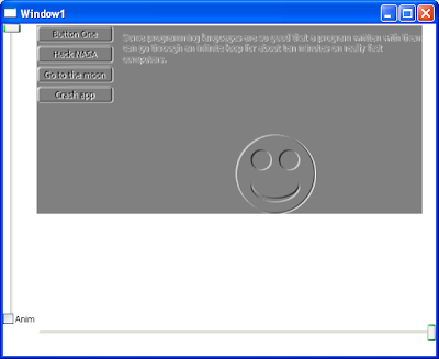
Now that we have the effect created in our project, we finally can see it in action in our user interface. Let’s create some demo interface, nothing special, just to see the effect.

I created something like this, just for fun:


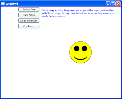
And here’s the XAML code:

<Grid>

<Grid.ColumnDefinitions>

<ColumnDefinition Width="100" />

<ColumnDefinition />

Grid.ColumnDefinitions>

<StackPanel>

<Button x:Name="btnTest1" Content="Button One" Margin="2"/>

<Button x:Name="btnTest2" Content="Hack NASA" Margin="2"/>

<Button x:Name="btnTest3" Content="Go to the moon" Margin="2"/>

<Button x:Name="btnTest4" Content="Crash app" Margin="2"/>

StackPanel>

<TextBlock Grid.Column="1" Text="Some programming languages are so good that a program written with them can go through an infinite loop for about ten minutes on really fast computers."

TextWrapping="Wrap" Margin="10" Foreground="Blue"/>

<Canvas Grid.Column="1" Width="100" Height="100">

<Ellipse Width="100" Height="100" Fill="Yellow" Stroke="Black"/>

<Ellipse Width="25" Height="25" Fill="Black" Canvas.Left="20" Canvas.Top="20" />

<Ellipse Width="25" Height="25" Fill="Black" Canvas.Left="55" Canvas.Top="20" />

<Ellipse Width="60" Height="40" Fill="Black" Canvas.Left="20" Canvas.Top="45" />

<Ellipse Width="60" Height="36" Fill="Yellow" Canvas.Left="20" Canvas.Top="44" />

Canvas>

Grid>

So, let’s apply our effect.

Add a namespace reference to the shader class in the XAML code, something like this:

xmlns:sh="clr-namespace:Shazzam.Shaders"

Set the effect for the root grid:

<Grid.Effect>

<sh:PixelateShaderEffect

Horizontalpixelcounts="200"

Verticalpixelcounts="200"/>

Grid.Effect>

Now, we run the application and see what happens:


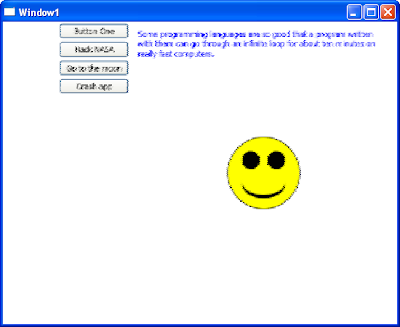
Nice! The effect was applied. That’s it. Simple, right?

Things to play with

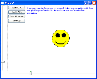
Testing effects in real time in the application interface

Just for fun, I continued working on my shader effects demo application. I added two sliders that can control the effect, just like it was in Shazzam. Only, this works on a real application interface, so it’s more interesting.


<Grid>

<Grid.ColumnDefinitions>

<ColumnDefinition Width="40" />

<ColumnDefinition />

Grid.ColumnDefinitions>

<Grid.RowDefinitions>

<RowDefinition />

<RowDefinition Height="40"/>

Grid.RowDefinitions>

<Grid Grid.Column="1">

<Grid.ColumnDefinitions>

<ColumnDefinition Width="100" />

<ColumnDefinition />

Grid.ColumnDefinitions>

<StackPanel>

<Button x:Name="btnTest1" Content="Button One" Margin="2"/>

<Button x:Name="btnTest2" Content="Hack NASA" Margin="2"/>

<Button x:Name="btnTest3" Content="Go to the moon" Margin="2"/>

<Button x:Name="btnTest4" Content="Crash app" Margin="2"/>

StackPanel>

<TextBlock Grid.Column="1" Text="Some programming languages are so good that a program written with them can go through an infinite loop for about ten minutes on really fast computers."

TextWrapping="Wrap" Margin="10" Foreground="Blue"/>

<Canvas Grid.Column="1" Width="100" Height="100">

<Ellipse Width="100" Height="100" Fill="Yellow" Stroke="Black"/>

<Ellipse Width="25" Height="25" Fill="Black" Canvas.Left="20" Canvas.Top="20" />

<Ellipse Width="25" Height="25" Fill="Black" Canvas.Left="55" Canvas.Top="20" />

<Ellipse Width="60" Height="40" Fill="Black" Canvas.Left="20" Canvas.Top="45" />

<Ellipse Width="60" Height="36" Fill="Yellow" Canvas.Left="20" Canvas.Top="44" />

Canvas>

<Grid.Effect>

<sh:PixelateShaderEffect

Horizontalpixelcounts="{Binding ElementName=slHori, Path=Value}"

Verticalpixelcounts="{Binding ElementName=slVert, Path=Value}"/>

Grid.Effect>

Grid>

<Slider x:Name="slHori" Minimum="10" Maximum="500" Value="500" Grid.Row="1" Grid.Column="1"/>

<Slider x:Name="slVert" Minimum="10" Maximum="500" Value="500" Orientation="Vertical" />

Grid>

Animating the shader effects

Animating the effects is very simple. Just like any other animation in WPF.

<Window.Resources>

<Storyboard x:Key="effectStory" >

<DoubleAnimation Storyboard.TargetName="shaderEffect"

Storyboard.TargetProperty="Horizontalpixelcounts"

From="10" To="500" Duration="0:0:10" AutoReverse="True" RepeatBehavior="Forever"/>

<DoubleAnimation Storyboard.TargetName="shaderEffect"

Storyboard.TargetProperty="Verticalpixelcounts"

From="10" To="500" Duration="0:0:10" AutoReverse="True" RepeatBehavior="Forever"/>

Storyboard>

Window.Resources>

Other shader effects

Motion Blur:

<sh:DirectionalBlurShaderEffect Bluramount="0.005" Angle="45" />
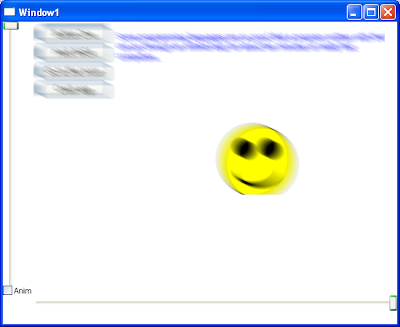

Embossed

<sh:EmbossedShaderEffect Width="0.002" Amount="0.5" />


Download Sample

You can download the sample application here: Download Sample