Saturday, May 22, 2010

Memory Leaks in WPF applications

In order to avoid creating memory leaks in WPF applications you need to know how to cause them. Here’s a list of the most common situations that cause memory leaks.

  • Event handlers to objects in parent windows
  • Registering to events from static objects
  • Using timers
  • Data binding
  • Changing the Text property of a text box

The Sample Application

I made a very simple application that demonstrates different cases of memory leaks.

app_overview

It has several buttons each launching a specific memory leak case. On the top there’s a “Collect Garbage” button that forces a garbage collection, so that you can see if the memory gets cleaned or not. Each case has a checkbox that represents the solution / fix to the memory leak.

eventhandlers

To help us see the memory leaks, I added a 100 MB array in each of the child windows, so it’s very easy to notice if the memory gets cleaned or not in Task Manager.

memusage 

Event Handlers

Imagine you have the following situation: You have 2 windows. The first one has a text box inside. The second window (a child window) registers to the TextChanged event of the textbox in the first window. Now, since this textbox remains alive (because it’s in the main app window), the child window will remain alive in memory even if it’s closed.

public void RegisterEvent(TextBox textBoxFromParentWindow)
{
this.textBoxFromParentWindow = textBoxFromParentWindow;
textBoxFromParentWindow.TextChanged += new TextChangedEventHandler(textBoxFromParentWindow_TextChanged);
}


Fix


The fix for this is simple  - just unregister the event when the child window closes.


protected override void OnClosed(EventArgs e)
{
base.OnClosed(e);

if (chkUnregister.IsChecked == true)
{
this.textBoxFromParentWindow.TextChanged -= textBoxFromParentWindow_TextChanged;
this.textBoxFromParentWindow = null;
}
}


Events from static objects


If you register for an event that is declared in a static object, the memory will never be freed because the static objects always stays alive in memory.


MemoryHelper.StaticInstance.LeakingEvent += new EventHandler(StaticInstance_LeakingEvent);


Fix


Again, you can fix the memory leak by simply unregistering from the event:


protected override void OnClosed(EventArgs e)
{
base.OnClosed(e);

if (chkCleanup.IsChecked == true)
{
MemoryHelper.StaticInstance.LeakingEvent -= StaticInstance_LeakingEvent;
}
}


Timers


The use of timers in a window is very dangerous because when the window closes, the timer continues to be alive and ticking, thus keeping the window it’s in alive. Simple demonstration for this is the following piece of code:


timer = new DispatcherTimer();
timer.Tick += new EventHandler(timer_Tick);
timer.Interval = TimeSpan.FromSeconds(1);
timer.Start();


Try the sample application, to see that if you don’t explicitly stop the timer, it’ll continue ticking even when the window is closed.


Fix


To fix this memory leak you’ll have to explicitly stop the timer when you don’t need it anymore:


protected override void OnClosed(EventArgs e)
{
base.OnClosed(e);

if (chkCleanup.IsChecked == true)
{
timer.Tick -= timer_Tick;
timer.Stop();
}
}


Now the memory is released when the windows is closed.


Data binding


Sometimes when using data binding, you can cause a memory leak. An example situation: You have a container (for example a stack panel) and inside it you have a text block that binds to a property of the container. Memory leaks occur when the property of the source object is not a DependencyProperty. For example – stackPanel.Children.Count. If you bind to a dependency property, the memory is properly cleaned up.


Leaky data binding:


        <TextBlock Text="{Binding ElementName=layoutRoot, Path=Children.Count}" Margin="5 0" x:Name="leak"/>


Safe data binding:


        <TextBlock Text="{Binding ElementName=layoutRoot, Path=ActualWidth}" Margin="5 0" />


The ActualWidth property is a Dependency Property, so it does not cause a memory leak.


Fix


You’ll have to clear the data bindings for non-dependency properties when you don’t need them anymore:


protected override void OnClosed(EventArgs e)
{
base.OnClosed(e);

if (chkCleanup.IsChecked == true)
{
BindingOperations.ClearBinding(leak, TextBlock.TextProperty);
}
}


Changing the Text property of a text box


The TextBox control in WPF keeps a undo stack in memory which can cause problems when the text is changed lots of times. In the sample application there’s a button which starts changing the Text property 10 000 times. If you look at Task Manager you’ll notice that memory usage increases exponentially, and when you close the window, the memory is not released.


textbox


Fix


You can avoid this problem by limiting the number of undo operations that are kept in the stack.


textbox.UndoLimit = chkLimit.IsChecked == true ? 0 : int.MaxValue;


In the sample app you can see that when you check the “Limit” checkbox that changes the UndoLimit to 0, which essentially fixes the large memory usage, but of course disables the undo operations on the text box.


Download Sample


You can download the sample application and test the cases yourself.

Sunday, February 21, 2010

WPF 4.0 New Features: Windows 7 Taskbar Integration

In WPF 4 there are some features which help us to easily integrate our software with Windows 7 Taskbar. Some of these features are showing thumb buttons in the thumbnail preview, showing progress in the taskbar item, accessing jump and task lists in items’ context menu. All of these features are nicely wrapped in classes and added as dependency properties to Window and Application classes.

overview Windows 7 Taskbar components overview

Let’s start with describing what’s what in Windows 7 Taskbar.

whats_what

whats_what2

WPF Classes for integration

Now, let’s take a look at the classes that WPF 4 provides for interaction with these components. All classes are defined in System.Windows.Shell namespace.

  • TaskbarItemInfo – provides settings of how the taskbar thumbnail is displayed
  • ThumbButtonInfo – represents a Thumb Button
  • JumpTask – represents a shortcut to an application that can be started from the context menu
  • JumpPath – represents a link to a file in the context menu

The Countdown Timer example

Now, for better understanding of the concept of using taskbar components, I have designed a simple application which just counts down one minute. I’ll explain it by breaking it down to its basic functionalities. Let’s take a look.

The Thumb Buttons

Thumb buttons are buttons which are displayed in the thumbnail preview (see overview picture above). They can be used as quick access to main functions of the application. They are defined using the ThumbButtonInfo class.

<Window.TaskbarItemInfo>
<
TaskbarItemInfo x:Name="taskBarItemInfo"
ThumbnailClipMargin="40,40,40,100"
Description="Countdown Timer">
<
TaskbarItemInfo.ThumbButtonInfos>
<
ThumbButtonInfoCollection>
<
ThumbButtonInfo
DismissWhenClicked="False"
Command="{x:Static local:MainWindow.CmdStart}"
CommandTarget="{Binding ElementName=mainWindow}"
Description="Start"
ImageSource="Resources/play.png"/>
<
ThumbButtonInfo
DismissWhenClicked="False"
Command="{x:Static local:MainWindow.CmdPause}"
CommandTarget="{Binding ElementName=mainWindow}"
Description="Pause"
ImageSource="Resources/pause.png"/>
<
ThumbButtonInfo
DismissWhenClicked="False"
Command="{x:Static local:MainWindow.CmdStop}"
CommandTarget="{Binding ElementName=mainWindow}"
Description="Stop"
ImageSource="Resources/stop.png"/>
<
ThumbButtonInfo
DismissWhenClicked="False"
Command="{x:Static local:MainWindow.CmdReset}"
CommandTarget="{Binding ElementName=mainWindow}"
Description="Reset"
ImageSource="Resources/reset.png"/>
</
ThumbButtonInfoCollection>
</
TaskbarItemInfo.ThumbButtonInfos>
</
TaskbarItemInfo>
</
Window.TaskbarItemInfo>


Now, we can see that TaskbarItemInfo has sereval important properties:


  • ThumbnailClipMargin – this is the area that will be shown on the application thumbnail


  • Description – this is a description that will be shown in a tooltip above the thumbnail


Then we define the thumb buttons. For each button we can provide a description, a source of the image to be displayed, and a command to be executed (there are other properties, try to investigate them if you’re interested).


The Progress Indicator


Windows 7 can show a progress indication in the taskbar which is quite useful for some applications (for example Internet Explorer showing download progress, or in our countdown timer – the timer progress). TaskbarItemInfo has two properties for showing a progress indication in the taskbar.


  • ProgressValue – a percentage value, ranged from 0 to 1 controlling the current progress


  • ProgressState – an enumerable which controls the current state of the progress indicator.


ProgressState can take the following values:


  • None – the progress indicator is not active


  • Indeterminate – the progress is indeterminate


  • Normal – a normal state, showing the current progress


  • Error – the progress indicator shows the current progress, but highlights the bar indicating that there’s an error


  • Paused - the progress indicator shows the current progress, but highlights the bar indicating that the progress is paused.


None Indeterm.. Normal Error Paused
progress_none progress_indeterminate progress_normal progress_error progress_paused


Here’s how we can set the progress indicator in code:


taskBarItemInfo.ProgressState = TaskbarItemProgressState.Normal;
taskBarItemInfo.ProgressValue = 1.0 - currentTime.TotalMinutes;


The Jump List


We can allow our application to include it’s own shortcuts and file links in the context menu of the taskbar item. This is done by setting a property in the Application object, called JumpList:


<Application x:Class="Win7Shell.App"
xmlns="http://schemas.microsoft.com/winfx/2006/xaml/presentation"
xmlns:x="http://schemas.microsoft.com/winfx/2006/xaml"
StartupUri="MainWindow.xaml">

<
JumpList.JumpList>
<
JumpList >
<
JumpTask Title="Notepad"
Description="Open Notepad."
ApplicationPath="C:\Windows\notepad.exe"
IconResourcePath="C:\Windows\notepad.exe"/> </JumpList>
</
JumpList.JumpList>
</Application>


So now Windows will display a shortcut to notepad in the context menu of the taskbar item of our application.


whats_what2


Be safe


Just a reminder when you use the taskbar integration of Windows 7 and WPF: The taskbar shortcuts, thumb buttons, progresses, are just to help the user see and do things more quickly. You should not use these components as your application’s main way of interaction with the user. Why? Because first of all, these components are not available in earlier versions of Windows. Also, even if the user runs Windows 7, there are some other concerns: for example the thumbnail preview is not available when Windows Aero is disabled. Of course, don’t worry, your application will still be able to run, just it’s taskbar functions will not be available.


Download Sample


You can download my Countdown Timer application to better understand the use of there components.

Saturday, February 20, 2010

WPF 4.0 New Features: Text

In the next series of posts I will write a little bit about the new features in the new WPF, part of Microsoft .NET Framework 4.0. So let’s begin with the improvements in text.

Text Rendering Stack

Microsoft has significantly improved the way texts are rendered on the screen. They introduced several new options to allow us define the parameters of text rendering. These options are encapsulated in the properties TextOptions. TextFormattingMode and TextOptions. TextRenderingMode of the TextBlock and TextBox controls.

TextFormattingMode can accept the following values:

  • Ideal (the default formatting mode)
  • Display

As for TextRenderingMode, there are four available options:

  • Auto (the default mode)
  • ClearType
  • Grayscale
  • Aliased

The differences in rendering and format modes are difficult to see. The resulting rendered text depends on other properties and use cases – for example: font size, transformations, etc. We can see a simple example using the Display Formatting with normal text and scaled text here:

smalltext zoomed_text

You can see that although display formatting may look better in some cases, it looks ridiculously ugly in other cases, as in when it’s scaled.

Now let’s see a comparison between all of the options in different use cases.

  • Small Text
compare_smalltext
  • Large Text
compare_largetext
  • Rotated Text
compare_rotated
  • Scaled Text
compare_scaled

Here’s an example of how these properties are used. It’s quite simple:

<TextBlock FontSize="8" Text="Display formatting" TextWrapping="Wrap" Margin="5"                       TextOptions.TextFormattingMode="Display"        TextOptions.TextRenderingMode="Auto"                       />


TextBox’s Caret and Selection Brush


Great new thingy in WPF 4 is the introduction of two additional Brush properties of the TextBox control.


  • CaretBrush – specifies the brush of the blinking caret in a TextBox


  • SelectionBrush – specifies the brush of the selection background in a TextBox


Let’s see how these properties are used:


<TextBox Text="CaretBrush" Margin="5">
<
TextBox.CaretBrush>
<
LinearGradientBrush StartPoint="0.5 0" EndPoint="0.5 1">
<
GradientStop Color="LightBlue" Offset="0"/>
<
GradientStop Color="Blue" Offset="0.4"/>
<
GradientStop Color="Pink" Offset="0.7" />
<
GradientStop Color="DarkRed" Offset="1" />
</
LinearGradientBrush>
</
TextBox.CaretBrush>
</
TextBox>


<TextBox Text="SelectionBrush" Margin="5" >
<
TextBox.SelectionBrush>
<
LinearGradientBrush StartPoint="0.5 0" EndPoint="0.5 1">
<
GradientStop Color="LightSteelBlue" Offset="0"/>
<
GradientStop Color="SteelBlue" Offset="0.5" />
<
GradientStop Color="DarkRed" Offset="1" />
</
LinearGradientBrush>
</
TextBox.SelectionBrush>
</
TextBox>


And the two text-boxes look like this now:


textbox_brushes


Bindable Runs


In WPF 3.5 the Runs (objects within a TextBlock or a Document) had their Text properties as standart CLR properties. Now in WPF 4 they are created as dependency properties, and therefore support the power of data binding.


        <TextBlock>
<
Run Text="{Binding FirstName}" />
<
Run Text="{Binding LastName}" />
</
TextBlock>


Custom Spellchecking Dictionaries


Microsoft has added the support for using custom spellcheckers, which can be loaded from a file or from app resources. A property has been added to the SpellChecker class – CustomDictionaries, which is essentially a list of URIs to the dictionary files (which, by the way are simple text files with one word on each line).


Let’s try one. We create a new text file, and call it for example MyCustomDictionary.lex. Note the extension is .lex.


spell_dictionary


Now, we will add a simple TextBox and tell it to include that dictionary in the spellchecker.


<TextBox Grid.Column="2"
Margin="5"
SpellCheck.IsEnabled="True">
<
SpellCheck.CustomDictionaries>
<
sys1:Uri>MyCustomDictionary.lex</sys1:Uri>
</
SpellCheck.CustomDictionaries>
</
TextBox>


So now the spellchecker will recognize the words in this dictionary, and include them in the suggestions.


spellcheck


That’s all for texts in WPF 4 for now. As always, you can download the sample application to better understand how things work.


Download Sample


You can download the sample project by following this link. Note: This is a VS2010 Project. Executables are also included.

Sunday, October 18, 2009

Behaviors Library for WPF

In my previous post, Behaviors in WPF with Expression Blend 3, I explained some basics about behaviors with Expression Blend 3. So now, I decided to start working on a library that will combine (hopefully) lots of behaviors for everyday use. I started with several behaviors for Window objects.

Here is what the library contains for now:

  • WindowDragMoveBehavior – When attached to a window, this behavior allows the window to be moved with the mouse, but not just by dragging the title bar of the window, as is the default behavior, but by clicking on any point of the window, and then moving the mouse. This is useful when you have skinned apps and you don’t actually have the title bar.
  • AnimatedShowHideElementBehavior – Animates the showing or hiding of a framework element (works best for window elements now). Supports several types of animations:
      • Fade In
      • Fade Out
      • Zoom In
      • Zoom Out
      • Skew

Using the library is simple, just add a reference to the .dll file in your project and Expression Blend will start showing the new behaviors in the assets:

assets

Then, just drag and drop the behavior to an element to start using it:

attached

And you’ll see the settings of the behavior in Blend:

properties

Of course, this library is very small now, and i promise that I will add more and more behaviors when I have the time. Any suggestions will be appreciated.

Download the behaviors library

You can download the behaviors library and a small demo project from this link.

Behaviors in WPF with Expression Blend 3

In Expression Blend 3, there is this new cool thing, called behaviors. In very simple words, these are special forms of objects which are attached to another object (usually an element in the UI) and perform some actions thus defining the behavior of the element. The cool thing is that behaviors are reusable, and can be created in libraries and used in many projects. They're not tied to a specific application logic. Another nice thing is that once created, behaviors are extremely easy to attach to an element in XAML.

To demonstrate the power of behaviors, I decided to create a very simple pong-like game ( a game with a ball that is moving around the screen and you have to keep it from escaping) and I used 2 custom behaviors. So let's go through the process.


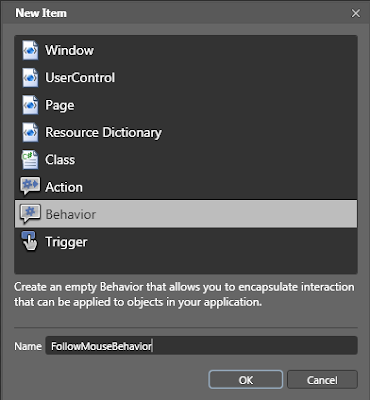
Getting Started

Creating a custom behaviors is pretty simple. In Expression Blend, go to File -> New Item, and select Behavior.


Then, the code-file of the behavior will be opened. You can edit in Blend of course, but when it comes to writing code, I prefer Visual Studio.

The structure of a behavior
Blend will define a skeleton for your behavior. The most important methods inside are the OnAttached() and the OnDetaching() overrides. As suggested by the name, the OnAttached() method executes when the behavior is being attached to the element, so you should do some initializations there. In the OnDetaching() method, you can provide cleanup. Also in the behavior class you can define properties that control some settings. These properties will be displayed in the Properties section in Expression Blend when the behavior is selected.

The behaviors for my game
In my demo game, I need two types of objects. First type is the player controlled bars (four of them) that move on each side of the screen following the movement of the mouse. The second type is the ball that moves constantly and bounces off the player controlled bars. So as you can guess, I need two behaviors.

So let's see the first behavior I defined. I named it FollowMouseBehavior. Here is the C# code.


using System;
using System.Collections.Generic;
using System.Text;
using System.Windows;
using System.Windows.Controls;
using System.Windows.Data;
using System.Windows.Documents;
using System.Windows.Input;
using System.Windows.Media;
using System.Windows.Media.Imaging;
using System.Windows.Shapes;
using System.Windows.Interactivity;
using System.ComponentModel;
using Microsoft.Expression.Interactivity.Core;


namespace WpfBehaviorsSample
{
public class FollowMouseBehavior : Behavior<DependencyObject>
{
// add some private fields
private Panel parentPanel = null;
private Window parentWindow = null;

// add some properties for the behavior
public bool LockXAxis { get; set; }
public bool LockYAxis { get; set; }
public bool IsLimitedToParentPanel { get; set; }
public bool IsEnabled { get; set; }

public FollowMouseBehavior()
{
this.IsEnabled = true;
IsLimitedToParentPanel = true;
}

protected override void OnAttached()
{
base.OnAttached();

if (!DesignerProperties.GetIsInDesignMode(this) && this.AssociatedObject is UIElement)
{
// find the window and the panel in wich the current object is placed
parentWindow = Common.GetAncestorOfType(this.AssociatedObject, typeof(Window)) as Window;
parentPanel = Common.GetAncestorOfType(this.AssociatedObject, typeof(Panel)) as Panel;
if (parentPanel == null || parentWindow == null) return;

// add a handler for the mouse move event
parentWindow.PreviewMouseMove += new MouseEventHandler(parentPanel_PreviewMouseMove);
}
}

protected override void OnDetaching()
{
base.OnDetaching();

// Cleanup
if (!DesignerProperties.GetIsInDesignMode(this) && this.AssociatedObject is UIElement && parentPanel != null)
{
parentPanel.PreviewMouseMove -= parentPanel_PreviewMouseMove;
}
}


void parentPanel_PreviewMouseMove(object sender, MouseEventArgs e)
{
if (!IsEnabled) return;

// When the mouse is moved, make the attatched element to follow it

Point position = e.GetPosition(parentPanel);

if (parentPanel is Canvas)
{
double posX = LockXAxis ? Canvas.GetLeft(this.AssociatedObject as UIElement) : position.X;
double posY = LockYAxis ? Canvas.GetTop(this.AssociatedObject as UIElement) : position.Y;
if (IsLimitedToParentPanel && this.AssociatedObject is FrameworkElement)
{
double pW = parentPanel.ActualWidth;
double pH = parentPanel.ActualHeight;
double cW = (this.AssociatedObject as FrameworkElement).ActualWidth;
double cH = (this.AssociatedObject as FrameworkElement).ActualHeight;

if (posX > pW - cW) posX = pW - cW;
if (posY > pH - cH) posY = pH - cH;
}

Canvas.SetLeft(this.AssociatedObject as UIElement, posX);
Canvas.SetTop(this.AssociatedObject as UIElement, posY);
}
}

}
}


The code is pretty simple, so I don't think I need to explain it in depth. First of all we find in what window the element is placed, and we add an event handler to this window's mouse move event. Then on mouse move, we just get the mouse coordinates, and change the objects coordinates to follow, according to the settings we defined (for example lock X or Y axis. that causes the element to move only horizontally or vertically, of course it can be moved both horizontally and vertically).

OK, let's look at the second behavior. This will cause an element (in our case, the pong ball) to move around the screen and when it hits another object, to change it's velocity. So this is the MovingBouncingBehavior.


using System;
using System.Collections.Generic;
using System.Text;
using System.Windows;
using System.Windows.Controls;
using System.Windows.Data;
using System.Windows.Documents;
using System.Windows.Input;
using System.Windows.Media;
using System.Windows.Media.Imaging;
using System.Windows.Shapes;
using System.Windows.Interactivity;
using System.ComponentModel;
using System.Windows.Threading;
using Microsoft.Expression.Interactivity.Core;

namespace WpfBehaviorsSample
{
public class MovingBouncingBehavior : Behavior<DependencyObject>
{
private static Random random = new Random();
private Panel parentPanel = null;
private Window parentWindow = null;
private DispatcherTimer timerAnimation = null;
private Vector velocity = new Vector(0, 0);

public double MinVelocityX { get; set; }
public double MinVelocityY { get; set; }
public double MaxVelocityX { get; set; }
public double MaxVelocityY { get; set; }
public event EventHandler LeftParentBounds;

public bool IsEnabled { get; set; }

private TimeSpan animationInterval = TimeSpan.FromMilliseconds(10);
public TimeSpan AnimationInterval
{
get { return animationInterval; }
set { animationInterval = value; CreateTimer(); }
}

public MovingBouncingBehavior()
{
AnimationInterval = TimeSpan.FromMilliseconds(10);
MinVelocityX = 1.0;
MinVelocityY = 1.0;
MaxVelocityX = 10.0;
MaxVelocityY = 10.0;
}

protected override void OnAttached()
{
base.OnAttached();
if (!DesignerProperties.GetIsInDesignMode(this) && this.AssociatedObject is UIElement)
{
parentWindow = Common.GetAncestorOfType(this.AssociatedObject, typeof(Window)) as Window;
parentPanel = Common.GetAncestorOfType(this.AssociatedObject, typeof(Panel)) as Panel;
if (parentPanel == null || parentWindow == null) return;

velocity = new Vector(GetRandomVelocity(true), GetRandomVelocity(false));
if (timerAnimation != null) timerAnimation.Start();
}
}

protected override void OnDetaching()
{
base.OnDetaching();
if (!DesignerProperties.GetIsInDesignMode(this) && this.AssociatedObject is UIElement && parentPanel != null)
{
if (timerAnimation != null) timerAnimation.Stop();
}
}

private double GetRandomVelocity(bool x)
{
if (x)
{
return MinVelocityX + random.NextDouble() * (MaxVelocityX - MinVelocityX);
}
else
{
return MinVelocityY + random.NextDouble() * (MaxVelocityY - MinVelocityY);
}
}

private void CreateTimer()
{
if (timerAnimation == null)
{
timerAnimation = new DispatcherTimer();
this.timerAnimation.Tick += new EventHandler(timerAnimation_Tick);
}
timerAnimation.Interval = AnimationInterval;
}

void timerAnimation_Tick(object sender, EventArgs e)
{
if (!IsEnabled) return;
if (parentPanel is Canvas && this.AssociatedObject is FrameworkElement)
{
FrameworkElement ui = this.AssociatedObject as FrameworkElement;
Point pointNow = new Point(Canvas.GetLeft(ui), Canvas.GetTop(ui));
Point pointMoved = pointNow + velocity;

// check for collisions

bool collisionFound = false;

int cycleSafetyCounter = 50;
do
{
cycleSafetyCounter--;
pointMoved = pointNow + velocity;
Rect rc = new Rect(pointMoved, new Size(ui.ActualWidth, ui.ActualHeight));
collisionFound = false;

// scan all children of the canvas
foreach (UIElement child in parentPanel.Children)
{
if (child is FrameworkElement && child != ui)
{
Rect rcChild = new Rect(Canvas.GetLeft(child), Canvas.GetTop(child),
(child as FrameworkElement).ActualWidth, (child as FrameworkElement).ActualHeight);
if (rcChild.IntersectsWith(rc))
{
rcChild.Intersect(rc);
bool shouldReverseX = random.Next(0, 2) % 2 == 0;
bool shouldReverseY = random.Next(0, 2) % 2 == 0;
velocity = new Vector(
GetRandomVelocity(true) * (shouldReverseX ? -1 : 1),
GetRandomVelocity(false) * (shouldReverseY ? -1 : 1));
collisionFound = true;
break;
}
}
}
}
while (collisionFound && cycleSafetyCounter > 0);

Canvas.SetLeft(ui, pointMoved.X);
Canvas.SetTop(ui, pointMoved.Y);

if (pointMoved.X < 0 || pointMoved.Y < 0 || pointMoved.X > parentPanel.ActualWidth
|| pointMoved.Y > parentPanel.ActualHeight)
{
if (LeftParentBounds != null)
{
LeftParentBounds(this, EventArgs.Empty);
}
}
}
}
}
}

This behavior also has some settings. The ting it does, it creates a timer and then on each tick it moves the element to which it's attached, and checks for collisions. When a collision is found, the velocity is changed. Again, let's not go through the logic, the post is about behaviors, not about making a pong game.

Attaching a behavior to an element
As I said before, attaching behaviors is pretty simple. Now you'll see how it's done.


See? Easy. Just set which behavior to use and change some settings (or, leave the dafault values, of course). Now our element (rectangle in this case) has a behavior. When we run the application and move the mouse, we see that this rectangle moves with it. You can add this behavior to any number of objects, and they'll all behave alike. All that's left to do is attatch the MovingBouncingBehavior to the ball element, edit some brushes (because, the application has to look nice, of course), and run.
Few lines of code, and you have a working game. Pretty powerful things, behaviors.
Thanks for reading. If you want the full demo application, check out the link below.

Download Sample Application

You can download the sample from this link.

Thursday, September 24, 2009

Sorting and filtering databound listview in WPF

This is actually quite a simple thing, but a lot of people don't know it, so I'll explain how it's done. As you know, the concept of databinding in WPF is that you provide the visual elements with their data source and they know what to do with it. For example, give a collection of items to a listview, and the listview will generate its items automatically, without forcing you to get involved with the items' visuals, like back at the days of Windows Forms you had to individually create all ListViewItem elements, and so on. On the other hand, that was more direct approach - you know you have some list view items, and when you want to sort them, you just apply sorting to the collection of visual elements. But in WPF you don't have a direct access to the visual elements (ListViewItem). One way to sort a list view would be to modify the source collection. But it's a bit messy, sometimes the collection is read-only, and sometimes we don't want to change the source data.
So WPF offers a way to deal with this with the so called "View" object. It provides functionality to sort, filter, and group items in listviews or other controls that display a collection of items.

Filtering a ListView

Applying a filter to a listview is pretty simple. First, we need to get the view object from the listview, and then provide a predicate that should tell if an item will be included in the filtered view or not.


// Get the default view from the listview
ICollectionView view = CollectionViewSource.GetDefaultView(lstMovies.ItemsSource);

view.Filter = null;
view.Filter = new Predicate<object>(FilterMovieItem);

And now we define the predicate:


private bool FilterMovieItem(object obj)
{
MovieItem item = obj as MovieItem;
if (item == null) return false;

string textFilter = txtFilter.Text;

if (textFilter.Trim().Length == 0) return true; // the filter is empty - pass all items

// apply the filter
if (item.MovieName.ToLower().Contains(textFilter.ToLower())) return true;
return false;
}

The result is: we now have a working filter for our listview:


Sortinga ListView

The sorting is done in almost the same way. Again we get the view object and then apply some sort descriptions. We don't have to come up with some complicated sorting algorithm, it's enough to provide the property name of the data item by which the listview will be sorted, and the sort direction.


// .....

// Get the default view from the listview
ICollectionView view = CollectionViewSource.GetDefaultView(lstMovies.ItemsSource);

// .....
// .....

view.SortDescriptions.Clear();
view.SortDescriptions.Add(new SortDescription(propertyName, direction));

And now we have a support for sorting the items in the listview:


Of course, sorting and filtering can be applied at the same time, like in this case we have filtered movies which have names containing "matrix" and sorted them by rating:


Download sample application

The sample can be downloaded here: Download sample

Sunday, September 13, 2009

WPF Circle Launcher User Control and Application

Recently I started developing an user control for WPF which could replace the standard menu systems. The user control is a set of icons, ordered in a circle (or several circles, if there are a lot of icons), and each icon launches some functionality. The user control is customizable, there are parameters for the size of the icons, the radius of the circle, events for clicking and moving, etc.

Then I decided to create a simple application launcher using this control. It's something like a quick-launch menu - users can add shortcuts to applications they use frequently and then start them from there.

Here are some screenshots of the Circle Launcher:


The user control creates animations when the user passes over an icon with the mouse:


It supports transparency and the windows is at the top-level, so it's convenient to use. Also, when the icons become too much for just one circle, the control automatically expands itself.


The application is under development, but still, I decided to post a preliminary version here.
The current features include:
  • Adding new icons with drag and drop
  • Automatic saving of the icons to XML and then loading back on startup
  • Hotkey for showing the launcher - F12
  • Moving the launcher across the screen (by dragging the center circle) and saving it's position
  • Auto-hide when a shortcut is launched
  • Manual hide by double-clicking the center or using the context menu of the system tray icon
The features of the user control include:
  • Adding and removing shortcuts (Launcher Items)
  • Explicitly setting the properties of a shortcut - Name, Icon, Launch path, etc.
  • Events for launching, moving, double-click, etc.
  • Settings for the circle radius, max number of items in each radius, icon sizes
  • Animations
  • Built-in drag-drop support for shortcuts
  • Support for databinding
If anyone is interested in helping me to extend this application or the user control, please contact me. Even only with ideas. Any kind of help will be appreciated.

Download Circle Launcher

You can download the application from here. You'll need .NET 3.5 to run it.